Plotting Graphs in R
Although R’s main purpose is not creating high quality, publishable graphs, its plotting capabilities are sufficient even for graphically demanding fields of research such as medical image analyses and pattern recognition. Here you will learn how to create and interpret the most common type of graphs like point, line and bar plots, histograms and pie charts
Point and Line Plots
Assume you want to plot the values of the age variable of the blood pressure dataset. You can do so by using the plot() function. You can see that a new window with the plot figure opens in the R interface (Figure 4):
plot(mydata$age)
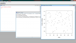
Figure 4: The Graphics Plot within the R Interface
Additionally, you can plot two variables against each other in an attempt to identify any correlation structures. For example you could plot the patient’s age against their SBPas shown (Figure 5):
plot(mydata$age,mydata$sbp)
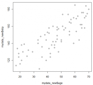
Figure 5: Scatter plot of Age versus SBP
By using the additional arguments in the plot function you can adjust, among others, the colour and type of line and the colour and style of the points as well as rename the legends of the y and x axis.
plot(mydata$age,mydata$sbp,ylab="Systolic Blood Pressure", xlab="Age", xlim=c(0,90),ylim=c(80,200), main="Blood Pressure vs Age scatter plot" )
You can overlay two graphs on the same figure in order to identify any trend or level differences. For example, in order to present differences in the increase of blood pressure between women and men you could plot two graphs one above the other:
plot(mydata_new$age[mydata_new$gender=="female"],mydata_new$sbp[mydata_new$gender=="female"])
points(mydata_new$age[mydata_new$gender=="male"],mydata_new$sbp[mydata_new$gender=="male"],col=2)
Similarly, two line plots could be overlaid using the lines() instead of the points() function (and adding the type=“l” statement within the plot function accordingly). In most plots you can also add an extra legend within the plot itself, where all plotted variables can be explained. To do so you would have to use the legend() function. The col=2 ajdusts the color of the points plotted.
Finally you can plot two figures side-by-side under each other or you can plot four figures in one plot using the mfrow option. For example, the function
par(mfrow=c(2,1))
forces two figures to be plotted under each other (in 2 rows, 1 column). Adjusting the rows and columns back to c(1,1) returns R to its normal plotting mode:
par(mfrow=c(2,1))
plot(mydata_new$age[mydata_new$gender=="female"],mydata_new$sbp[mydata_new$gender=="female"])
points(mydata_new$age[mydata_new$gender=="male"],mydata_new$sbp[mydata_new$gender=="male"],col=3)
plot(mydata_new$age[mydata_new$gender=="male"],mydata_new$sbp[mydata_new$gender=="male"])
points(mydata_new$age[mydata_new$gender=="female"],mydata_new$sbp[mydata_new$gender=="female"],col=4)
par(mfrow=c(1,1))
plot(mydata_new$age[mydata_new$gender=="male"],mydata_new$sbp[mydata_new$gender=="male"])
Bar Plots
Bar plots can be constructed with a similar style as the ones made in Excel or other graph-producing software. As an example you could plot in bars the SBP of the first five patients, change the bar colour and give names to every bar (Figure 6):
barplot(mydata$sbp[1:5],density=c(1:5),col=c(1:5), names.arg=c("1","2","3","4","5"),xlab="Patient ID",ylab="SBP" )
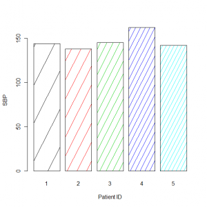
Figure 6: Bar plot of the SBP of the first five patients in mydata